UI
Overview
The example map(s)' UI is designed for mouse and keyboard. We have two examples available:
- Top-down (pick up items with the mouse). See
/Bolt/Gameplay/Maps/LV_BoltExample_TopDown - Third Person (pick up items by focusing on them and pressing
E). See/Bolt/Gameplay/Maps/LV_BoltExample_ThirdPerson
From here onward, assume we're talking about the example map's widgets.
The example map's widgets are examples. We expect most developers will want to add extra functionality or change the widgets entirely.
Common UI
The example map uses the engine's CommonUI plugin. When migrating widgets to your own project, make sure you have properly set up common UI.
Please double-check this before asking for support:
In Project Settings > Engine > General Settings, set Game Viewport Client Class to Common Game Viewport Client.
Design
Widgets for inventories are in the Bolt/Widgets/Inventories folder. These are widgets you will probably want in your own game, whereas widgets in the Bolt/Widgets/HUD folder are generally just for the examples. We will explain some key points here, but we will not go over individual implementations. We highly recommend looking at the widgets themselves to see what you would like to keep/change. The Reference Viewer tool (hotkey: Shift + Alt + R) comes in handy to check how the widgets interact with each other.
Widget Hierarchy
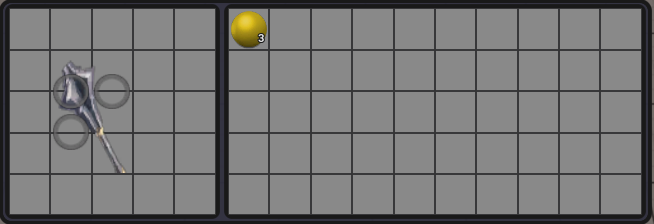
- Inventory windows are the top level widgets pushed to the HUD. For example, when interacting with a chest, it will show an inventory window.
- Inventory widgets represent a single inventory. Windows may have one or more inventory widgets.
- Individual slot widgets.
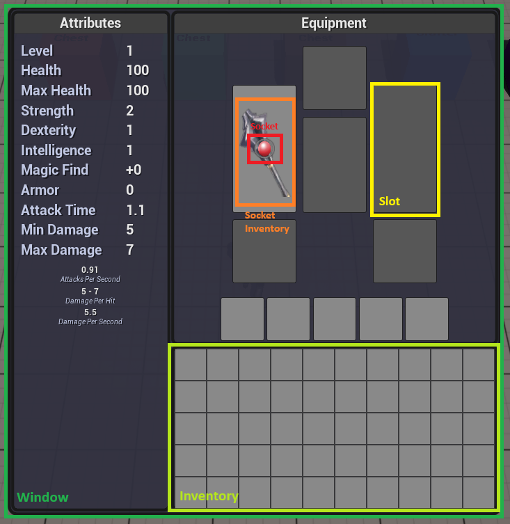
- Socket inventories (also known as equipment). These are also item stack widgets. Not all items can have sockets, but for simplicity they are all represented by a socket inventory widget.
- Sockets. These can hold socketable items.
Reusability
Inventory and item slot widgets may be reused across different contexts. For example, interacting with a chest uses the same inventory widget as when crafting.
Customizability
Developers may customize the actions that happen when a player interacts with a slot. For example, by default pressing Left Mouse Button will withdraw / deposit / swap items from the hovered slot, depending on what item the player is holding. But if you wanted you could make it use the item instead. See the Inventory Comparison View Model section for details.
Styling
Developers may customize how widgets look without affecting functionality. We use styling from the Common UI plugin.
- See the
/Bolt/Widgets/Stylesfolder for all styles in the example map. - See the
Widget Stylingsection in the Common UI Quickstart Guide for a quick overview of how styling works.
In brief, styles are each data-only blueprints. Common UI's widgets have a Style variable that can be swapped out to change how they look. You may also change the style at runtime by using the SetStyle function.
For custom widgets, you might want to create your own styles. For example, you might want a style for specifically 'simple inventory widgets' that has all of the button styles, text styles, etc. that the widget would need.
Feedback
Slot Overlay
When interacting with item slots, the widgets provide feedback to the player on what would happen. For example:
- Success
- Failure


Each slot widget asks the Inventory Comparison View Model what operation it will perform and the expected result using the Get Operation Result For Slot function. In the equipment example above, it might return the tag UI.Operation.Deposit and the resulting success/failure if the player decides to click on that slot. Using the Inventory Comparison View Model instead of implementing the overlay in the slot allows us to reuse the slot widget. See the Inventory Comparison View Model section for more details.
Error Messages
Trying to deposit into a slot that's not allowed will give the player a message describing why:
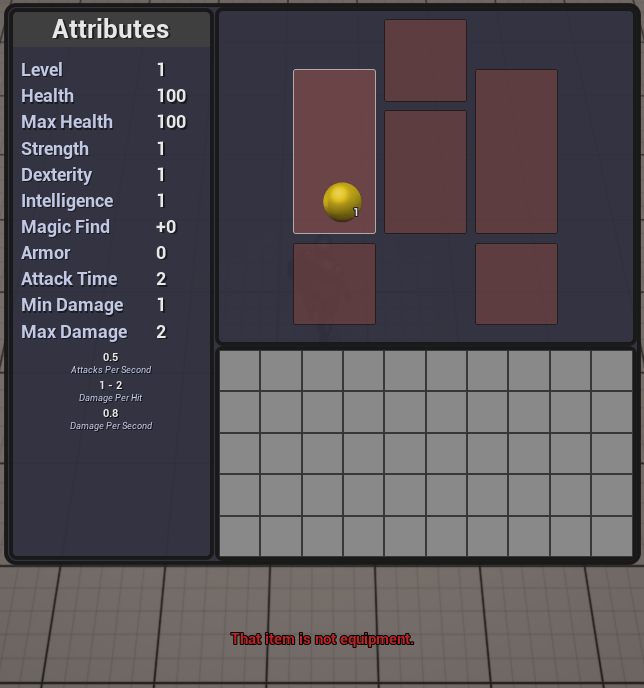
This is implemented with the plugin's ECResult struct. Whenever calling Bolt's functions, they return an ECResult corresponding to what happened (success or the error that occurred). The requester calls the SendFeedback function on the player controller, which uses the BP_GameplayFeedbackCatalog (folder: /Bolt/Gameplay/Feedback) class to map the ECResult to the error message and sound. Then it plays the sound and tells the HUD to display the error message.
The catalog is a data asset; you may create your own instances to further customize the feedback. To do this, right click on the content browser > Category Create Advanced Asset > Miscellaneous > Data Asset, and select the BP_GameplayFeedbackCatalog class.
The GFC_InventoryOperations asset handles all of the example map's error messages.
The default feedback structure (text and sound) will work for most games, but feel free to change it for your own game.
Guide
Opening UI from Game Objects
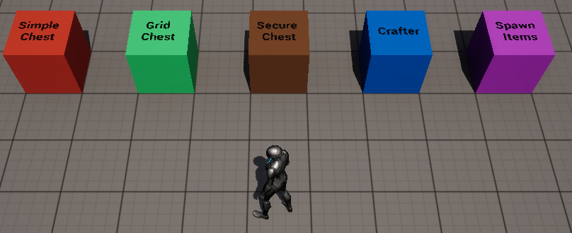
To start with, we'll go through how to open the UI in game. Click on any of the boxes to interact with them; this will open up a widget for it.
Internally, the object being interacted calls ViewInventory on the player controller through the BPI_PlayerWithInventory interface. We expect you will want a different interface for other game genres, but this method works for an ARPG.
Afterward, the player controller routes this to the W_HUD, which then creates a new window for the inventory:
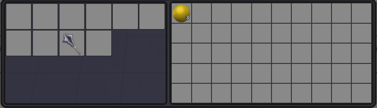
The left side is the chest's inventory and the right side is the player's backpack. Different inventory types can use a different widget; For example, it could use a grid inventory:
If you've looked at Epic's Lyra example, you might be familiar with the node Push Content To Layer For Player. We opted to implement something similar with layers on the HUD. You may use this node instead of the BPI_PlayerWithInventory interface; we avoided it to reduce code dependencies.
Moving Around Items
To move around items, you can left click the slot. Left click changes its behavior based on what's being held and what's in the slot.
- It will grab the slot's items if the held item slot is empty.
- It will deposit into the slot if held item slot is not empty and the item stacks can be combined.
- It will swap if both slots have items and they can't be combined.
This behavior is defined in the Inventory Comparison View Model.
Most slot widgets have buttons for interacting with them. Bolt includes the BLAdvancedButton, which forwards the PointerEvent structure in the OnClicked event. Unlike UMG's default buttons, this enables us to easily handle different inputs like Ctrl + Left Mouse Button, Right Mouse Button, etc. which are common in inventory UIs.
BLAdvancedButton also includes styling from CommonUI.
Held Item

The held item is the item attached to the player's cursor. It's stored in the HeldItemInventory on the player state. When the player moves around item stacks in their inventory, they're getting moved to/from the held item inventory.
The Inventory Comparison View Model manages widgets' interactions with the held item inventory; inventory widgets bind to its delegates instead of directly to the held item inventory. This lets the view model determine if items can be moved around depending on the context. For example, if interacting with a vendor, you might want to disallow holding items because they should be staged for sale instead.
Hotbar
The example map includes a simple hotbar for using items. You may assign items to the hotbar by opening the inventory (hotkey: I) and putting consumables into these slots:
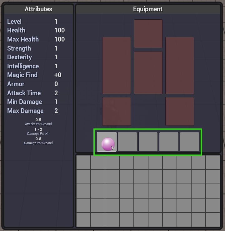
Assigned items will show at the bottom of the screen:
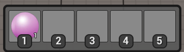
Pressing the numbers 1-5 will try to use the items in the hotbar slots. By default, only consumable items may be deposited into the hotbar.
You may only assign items to the slots. Depending on the type of game you're making, this might be sufficient for you; we will not be implementing an ability hotbar, as that is out of scope for an item system.
The hotbar's input labels don't change, because doing so would require:
- Icons for each input.
- UI for remapping keys.
Both of these are out of scope for the plugin. We opted for something simple to demonstrate how a hotbar could be done. Epic's Lyra example has a solid demonstration for key remapping UI.
Inventory Comparison View Model
- Blueprint Users
- C++ Users
Another key point: while we call this a view model, it doesn't use the UMGViewModel plugin. At time of writing, that plugin is still in beta and not production-ready.
This class is spawned by inventory windows when they are initialized. It has multiple responsibilities:
- It maps from inputs to actions.
- For example, when hovering over an item slot, players pressing
LeftMouseButtonmay withdraw the items from the slot.
- For example, when hovering over an item slot, players pressing
- After the action gets executed, it notifies the player controller of the result; the player controller can opt to display feedback to the player.
- When some slot widgets get hovered over, they change their overlay's style based on the action's result. See the slot overlay section for more details.
The view model is passed from the window widget to the inventories, to the slots, and all the way down the hierarchy. This way any widgets that need it may hold on to it. Here's a chart that shows how different classes interact with the view model:
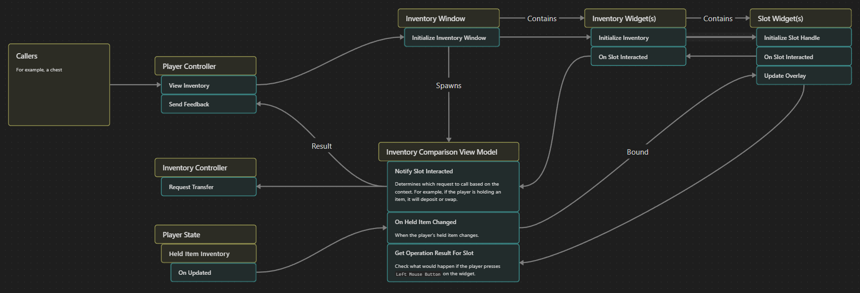
The view model is designed so you may create your own subclass to customize it. We expect that different contexts will want different view models. For example, when interacting with a vendor, you might want Ctrl + Left Mouse Button to stage an item for sale instead of moving it to the other inventory. Doing this with a view model allows us to reuse the inventory widgets.